M2 Master A Better Spotify

Team

  • Naomi Schoppa
  • Jakob Panten
  • Piranavi Satkunanathan
  • Phillip Kiele
  • Stefan Böhnert
  • Malin Dulkies
  • Lennard Grimm

Supervision

David Strippgen

Research

Since Spotify – with a whole team of experts behind it – is one of the global players in audio streaming, the question was how the team of seven students could improve the product in a short time. In the beginning, research had to be carried out in various directions in order to be able to identify possible optimisations and restructurings.

Basic questions like the target group and main focus points of our project had to be answered. This entailed not only researching different ideas on how to add new features to the already existing version of Spotify but also researching current trends regarding the design of music players and websites in general.
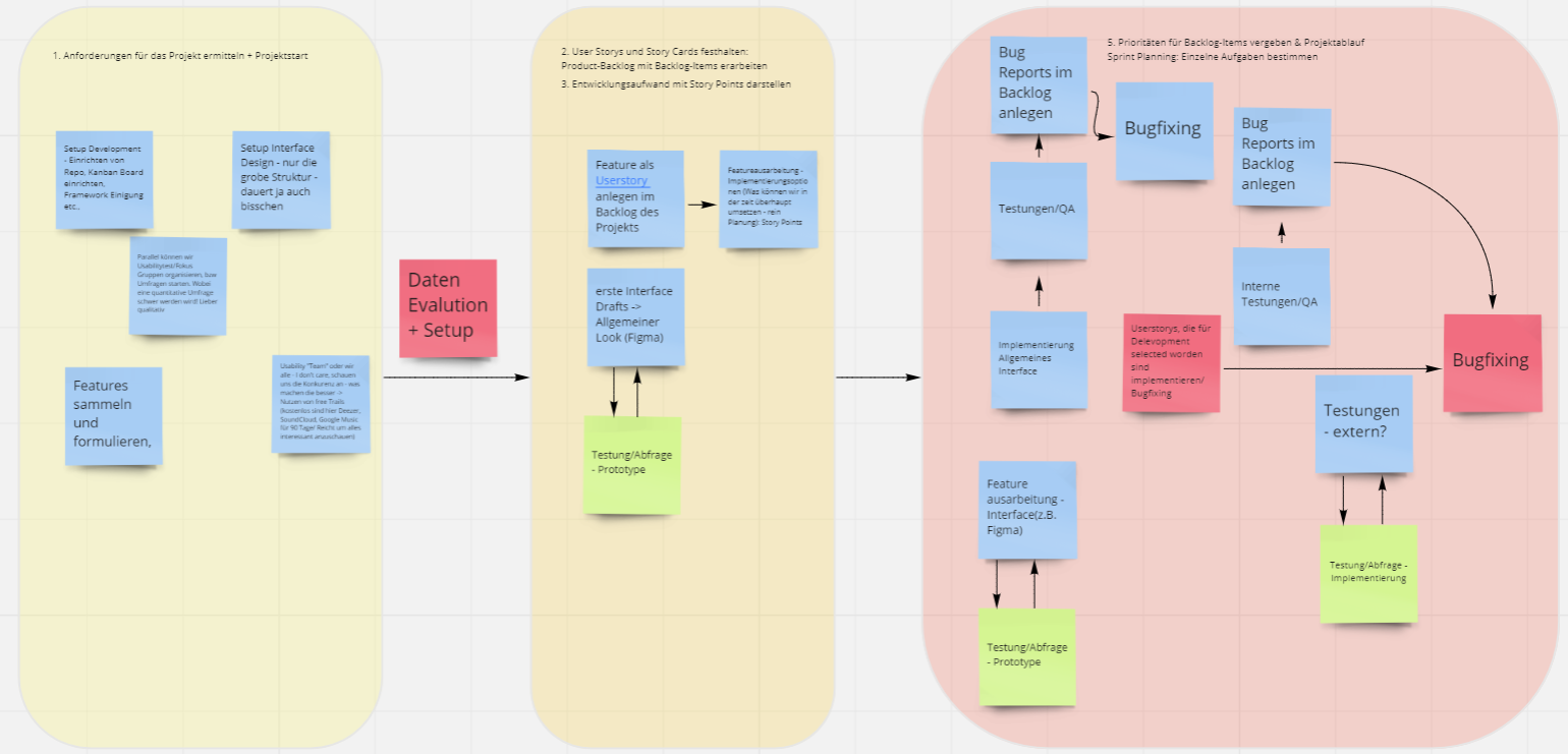
Pic of the first Drafts
Draft of the process

After approximately four weeks of intensive research, we decided to analyze Spotify, take the well-working features and optimize the identified problems with new and innovative solutions.

In order to gain qualitative data as to what exactly needed to be included, a focus group had to be interviewed to get an even broader array of data on the way than the internet and our own group had provided so far. Despite the pandemic, it was possible to invite ten heavy users of Spotify in compliance with the previous protective provisions, of course.
Pic of the Miro Board
First Idea Board

Focus Group

The focus group consisted of 10 people in total. That way we had a foolproof way to ensure the conversation wasn’t going to come to a haltand to encourage the external sources to give more input. In order to get the most out of the interview, we started a discussion in advance whether or not they would consider themselves heavy users of music streaming platforms (using those kinds of apps at the least every other day). The challenge was to initiate an exchange between the invited persons. That way we were able to assure that they knew the application well enough to be a trustworthy source of information.

Prepared questions for the Focus Group
Focus Group Cycle
  • In the beginning, we prepared a set of questions to get a grasp as to what kind of listener the focus group participants were.
  • Then we proceeded to give them the chance to simply think about the streaming platforms and name any kind of feature they would want to be refurbished in any way or even added because it didn’t even exist yet.
  • Lastly, the focus group was presented with a stimulus. In our case that was 3 different kinds of music player design handpicked from the research team of the group to show different approaches to modern designs. This step was crucial to spark new ideas in the participants’ minds and provide them with a different point of view on some features and even led to new wishes for features popping up.

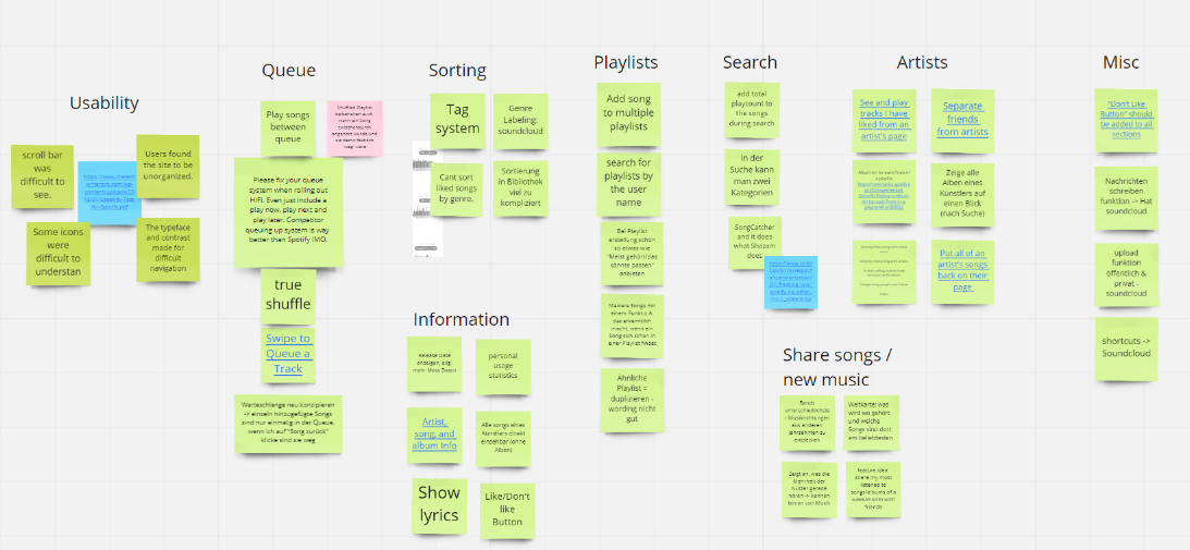
All of the different ideas discussed by and during the focus group were collected and written down into an affinity board. This was the best way to group the ideas, see whether or not duplicates were made and have a proper way to evaluate them. It also helped immensely with creating a general overview and scope for the project.

Pic of the affinityboard
The Affinityboard

First, we created different sections, grouping the possible tickets and ideas together before putting them into our kanban board. This board was used to provide the team with possible first tasks for implementation, as well as create a requirement sheet.

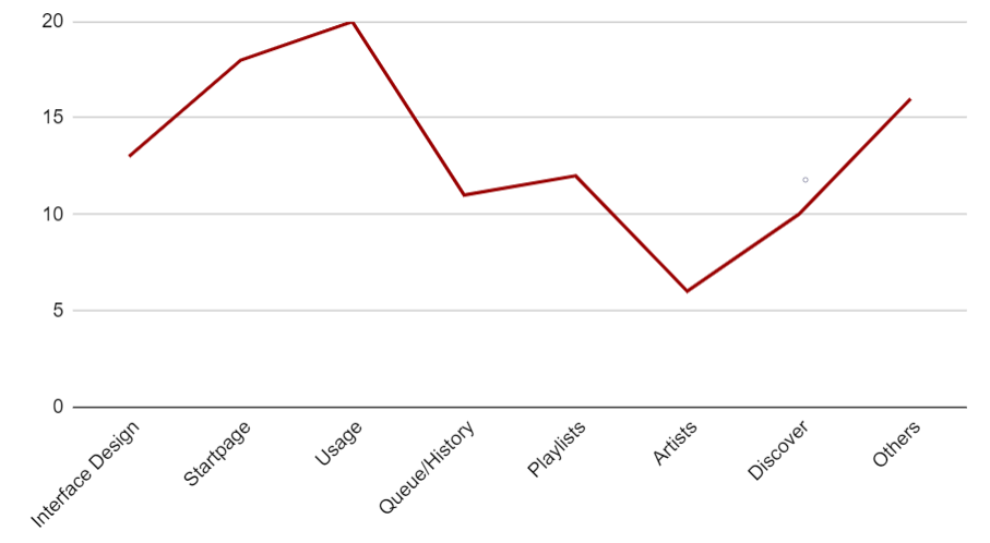
Said requirement sheet was important for the organization of the project because it provided the team with a way of prioritising the most important features. It also helped tremendously with creating graphs and tables that helped us stay on track of progress throughout the implementation process.

The Implementation Priorities
Priority Graph

Design

Quite early on, the team had decided to ensure that a proper design was ready for every single aspect of the project. This was owed to the team knowing from experience that proper preparation speeds up the implementation process greatly. Sticking to one design means that everything is a lot cleaner and consistent in itself and therefore needs much fewer changes later on.

Another point that made having a proper design very interesting and important was the possibility of checking the design whenever they were implemented. Instead of simply creating screens and passing them on to the team, each and every one of the designs was double-checked with a group of heavy Spotify users that agreed to give us continuous feedback. This way the designs were proved over and over again, ensuring that the usability standpoint was still the utmost priority throughout the entire process.

This meant trying out various possible design solutions, different interface versions and improving over and over again. It meant having to change details and features more than once and even throwing away the entire basic design based on user feedback.

The old Design
Old Design vs New Design

Implementation

The implementation was set up as we decided on our tech stack very early on in the project. Everybody decided on trying out React, some already worked with it beforehand, so the setup process began shortly after understanding the project and having a general idea of what needed to be done.

The team developed according to the Scrum method. Since the project is based on an approx. 15h week, there was a weekly instead of a daily scrum. Every Monday the team got together to speak about the personal progress, mention challenges they were facing and select new tickets from the ticket backlog to continue working on. During the development months, meetings took place with the professor - which could be seen as stakeholder meetings. The team worked independently and was self-organized. All decisions and planning were only made by the team and not by the professor.

Each team member worked on self-selected tickets from the backlog. For this purpose, a continuously updated Kanban board was created and used throughout the entire project. When problems arose and a team member was stuck, the pair programming method was used. Additionally, small groups were formed to take on larger challenges. This ensured that the full knowledge of the whole team was utilized.

Kanban board on Github
Project on Github

Working remotely on a project and finding multiple time slots in a week that work for all seven members of the team wasn’t realistic. With the help of digital meeting rooms such as Zoom, social distancing was no problem and subgroups of the team were able to meet up whenever needed. Discussions and questions were held in a Discord Server with multiple channels in order to be able to act and communicate quickly.

User Testing

To cover the whole process this project entailed, we decided to finish it with usability tests for our application, using, once more, heavy users of Spotify, to test our application. The team wanted to find out if we managed to improve the user journey as planned. Therefore, in total 6 usability testings were made to consolidate remaining usability issues. The idea was to invite people, who were participating in the focus group too and some who have never seen the project ideas before. The tests were held in Zoom with the tester, a moderator and a second person from the team, who took notes.

The gist of user tests like these was letting the user take over the application and have them navigate through the different features and explore the app on their own. This was entirely to ensure that the user would have the same experience as they would normally when using a new application. Having the test users think aloud and comment on every single detail they see helped find out anything they were displeased with or simply confused by so that the team could react to them.

Luckily, the interviews showed that the team did a good job in incorporating the different features that were needed. The customizable homepage was commended greatly by the participants of the tests and the tag system was applauded as well. Seeing how well the usability tests worked in gathering data and improving the UX to end up with a system the user actually wants, was more than anything the team could have dared to expect.