Our unique selling point is our improved Startpage.
Customize the Startpage
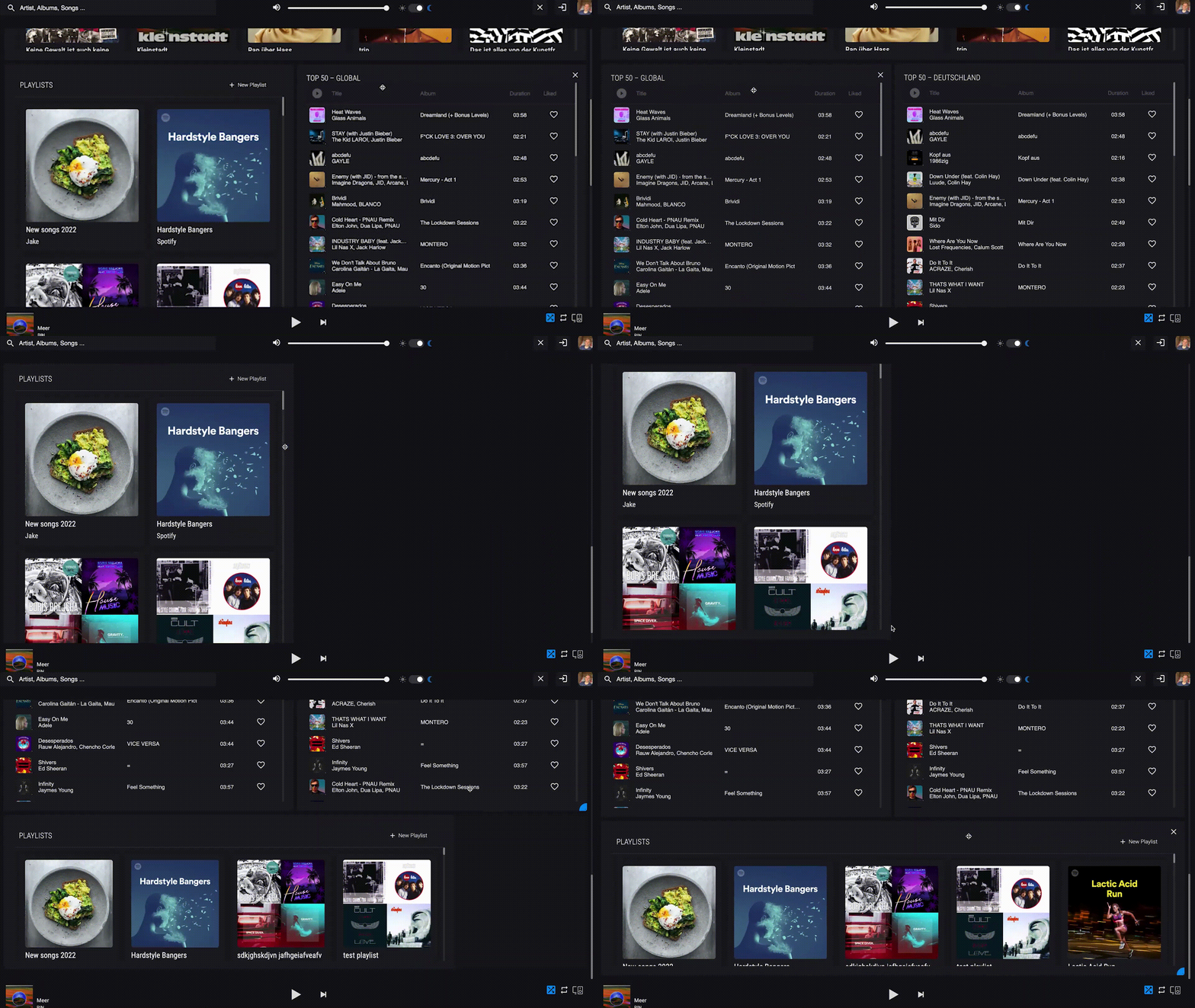
Better Spotify changes that by replacing the Startpage with a widget system based on a grid layout. The widgets can be chosen by the user to give them the possibility of making the choice whether or not they want certain parts to be displayed.
Additionally, the widgets are moveable via drag-and-drop which makes it even easier for the user to customize the Homepage to their own needs and wishes. The grid adjusts while a widget is being moved and automatically shifts everything else to make space. This way, the user has a visual representation of where everything will end up once they drop the widget into its space.
Moreover, it is possible to change the widget’s size to their desire so that they can properly shift their homepages focus on whichever feature they need the most. This includes making more information visible as soon as the widget’s size increases and reducing the info displayed to make use of the fewer space left.
Finally, being able to add the favourite playlist to the homepage results in a faster use of the system. The user avoids long click iterations and gets to their desired screen a lot smoother.
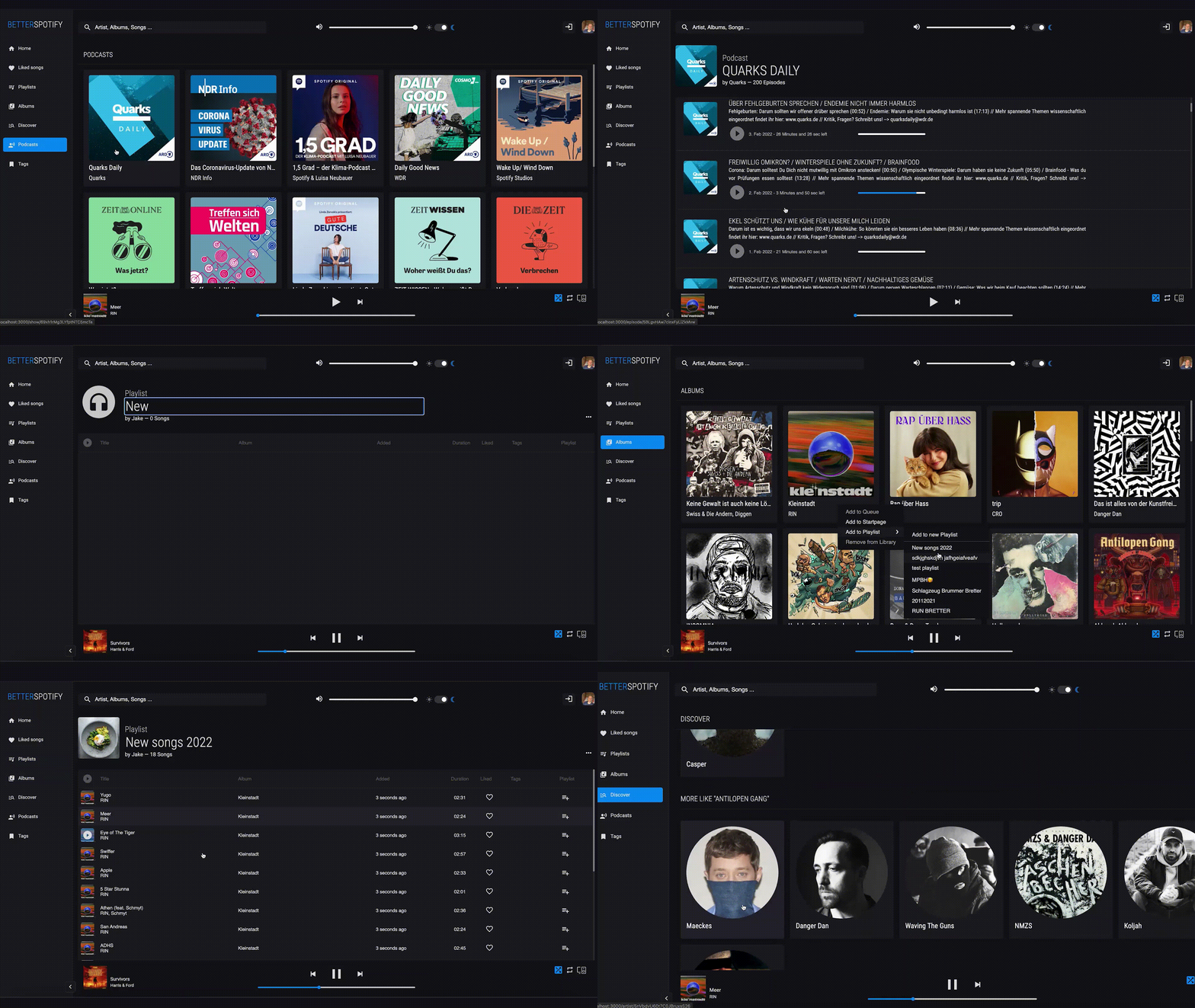
*In comparison: Web Spotify’s Startpage is filled with content the user doesn’t need or doesn’t want on there, e.g. Podcasts. Instead of being greeted with the features and information, they do want, the user has to scroll a lot and doesn’t have the chance to customize it to their needs. *
Avoiding errors
To help the user on their way, we prepared the homepage with the most useful features for the wide variety of Better Spotify users and had them pre-arranged on the board. To ensure that there are no unintentional changes to the layout, the adjustment of the grid system needs to be activated via the press of the edit button. Only then will the editor appear. Otherwise, the Homepage is locked into place and usable as usual.


