Requirements Analysis

To avoid aimless brainstorming, we decided in advance to map our concept to a specific course, while still keeping in mind that certain functionality and components should be reusable for the implementation of additional learning content. We were certain that we wanted to use a genuine IMI-course, and after much consideration, we opted for “M1 - Media Programming”. The importance of this course and its aim to bring all students to the same level in the fields of Visual Computing, Web Development, and Game Technology were compelling reasons. Additionally, many of us had already taken this course, providing us with essential knowledge for our further concept. Once we decided on a course, we embarked on a journey to review the course material thoroughly. Our goal was to identify topics which can be taught in a more interactive way that conveys the subject matter in a more exciting, but also knowledgeable way. We focused especially on topics which have a high potential for interactive examples within our application.
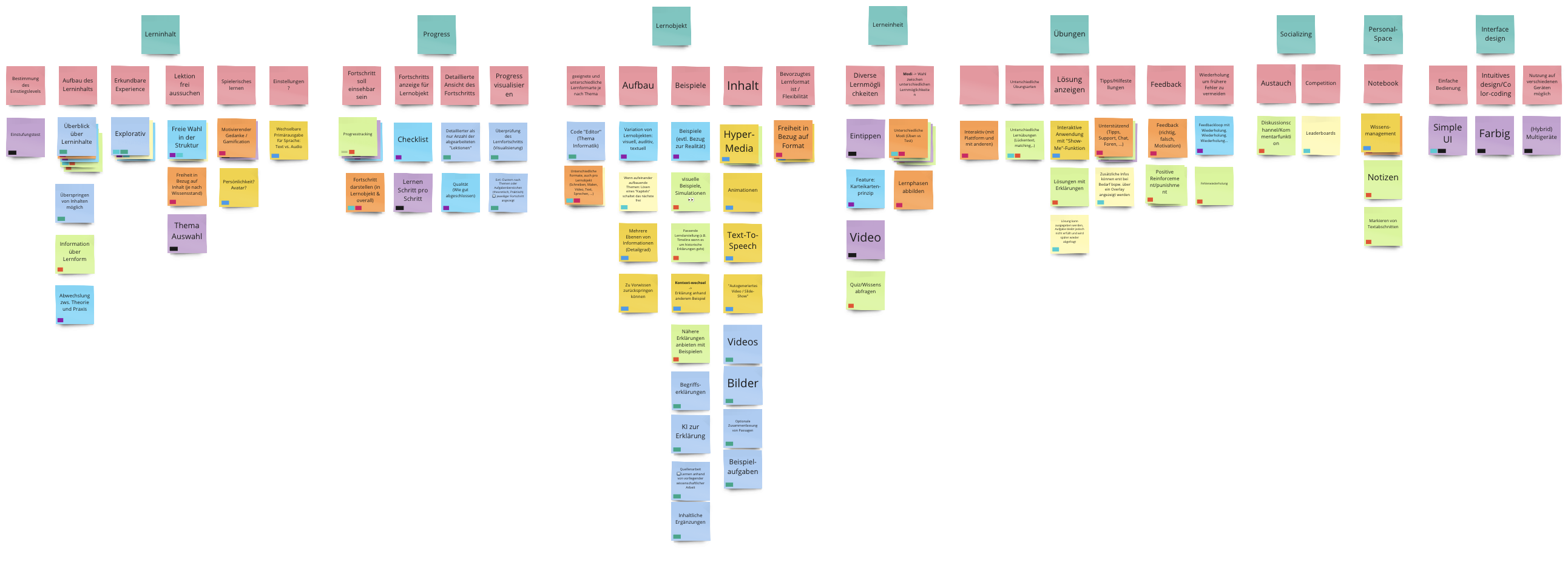
Next, we held multiple brainstorming sessions to generate potential ideas for interactive examples and a general outline for our learning platform. We scribbled numerous concepts and developed small prototypes to visualize our ideas and assess their feasibility and finally came up with a concept that we were excited to implement.Concept

Design
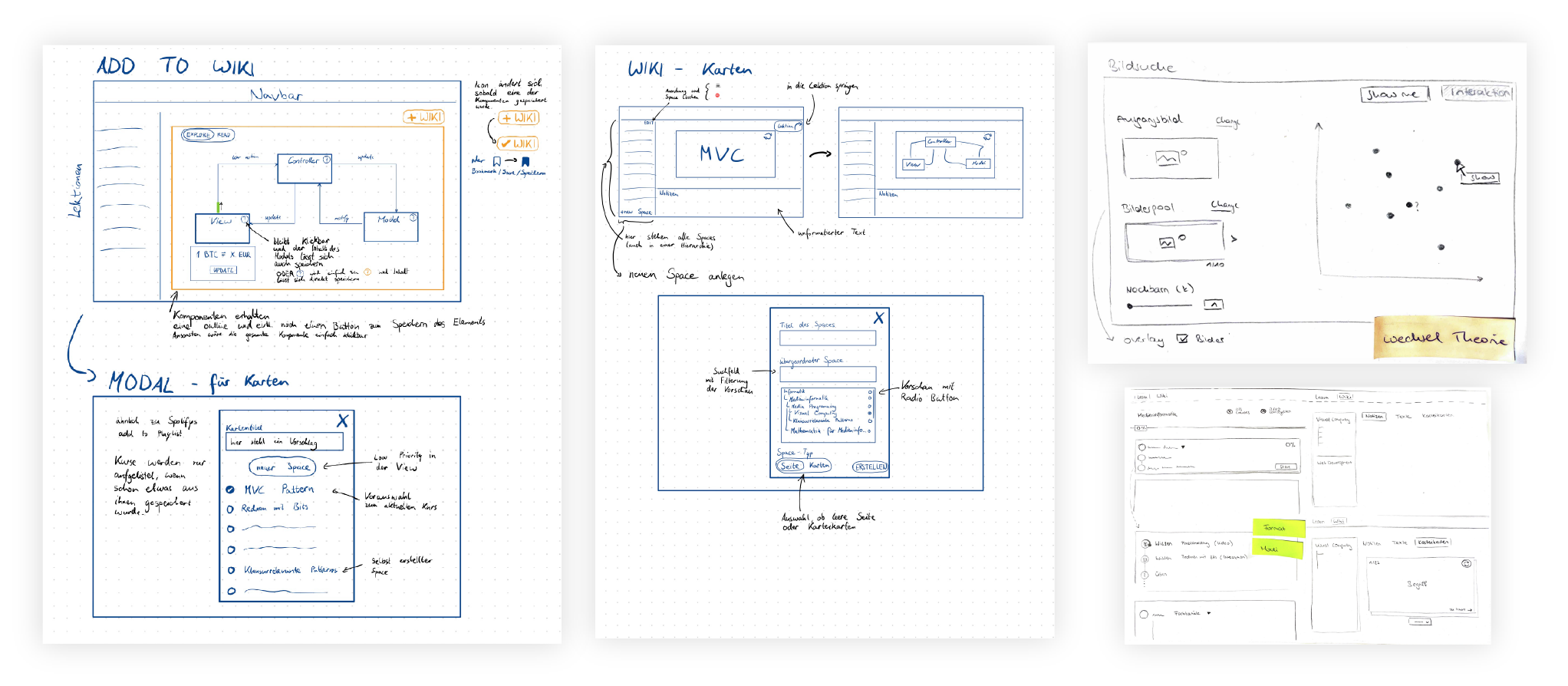
Following the completion of our concept, we moved onto the design process. First of all wireframes were created to define the feature set more concretely and establish a solid foundation for the high-fidelity prototype, that was then developed using Figma.
In digital learning environments, UI and UX design contribute significantly to the user experience, but also to the user’s learning experience and outcome. Therefore, a clear course design with unambiguous symbols, labels and user guidance was also essential in the design of Intu. The primary goal was therefore to create an appealing and purposeful user interface that motivates and delights users while maintaining a strong focus on the main learning content. This balance was vital to ensure an engaging yet effective learning environment for our users. The entire design of Intu is thus based on a friendly color composition, a clean and well-structured layout, lightweight components and in general an unobtrusive interface design.
In the end, we were thoroughly pleased with our design, and it served as a reliable guide throughout development. We consistently worked towards reproducing the prototype to ensure that our final product matched our initial vision and expectations.
Didactic & Learning Goals
For each of the topics that we wanted to cover in our application, we set clear and specific learning goals. To ensure that our goals were both structured and effective, we applied the principles of Bloom’s Taxonomy, an educational framework that organizes learning goals into a hierarchical structure. In essence, Bloom’s Taxonomy encompasses six levels of cognition, ranging from basic knowledge recall to sophisticated creative processes.
However, due to time constraints, we recognized that covering all six levels of Bloom’s Taxonomy was not feasible. Instead, we decided to concentrate on three foundational levels: Knowledge, Comprehension, and Application.
By focusing on these levels, we defined learning goals that helped us maintain a clear direction during the conceptual phase of our project. This focus was important in shaping the concepts for our learning objects, ensuring they were relevant and effective.
Moreover, these carefully crafted learning goals serve to provide our users with a precise definition of the knowledge they can expect to acquire throughout the course. This clarity in learning outcomes guarantees that our users are fully aware of the skills and knowledge they will gain, enhancing the overall learning experience.
Implementation
For the implementation of the frontend, the minimum requirement was the use of ReactJS and MUI. Since not every member of the team had the necessary knowledge from the beginning, the development started with a small crash course and self-study. Fortunately, the training was rather fast, as most members already had experience with web development.
In the development phase, we worked in weekly sprints and met online at least once a week to discuss updates on the application and the overall progress. We adopted a strict pull request workflow to both ensure code quality and foster dynamic learning among team members. Also, if there were any problems, they were addressed immediately to avoid delays in development.
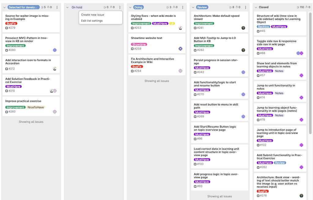
For task organization, our project manager took care of the backlog and task allocation in GitLabs’ Kanban board, creating additional tickets as needed. This approach allowed the other team members to focus primarily on executing their tasks.
