M3 Master What happened here

Team

  • Paula Osterkamp
  • Luis Hankel
  • Emily Gilbert
  • Mahja Sarschar

Supervision

Alexander Kramer

Idea

The initial idea for this project was brought to HTW by the Marc Sinan Company, that is currently working on a project creating different audio walks through Berlin in order to educate about its history of forced labour. The task was to build a mobile app, that would allow users to follow the audio tours and navigate them through the city and a content management system, to maintain the data from their side. Because of a heavy workload on both sides and non-aligning deadlines, the cooperation could not be realized throughout the whole project, but they encored us to put our own spin on the main idea and use their data to test what we came up with.

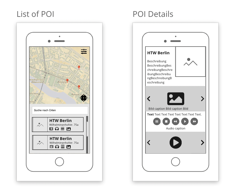
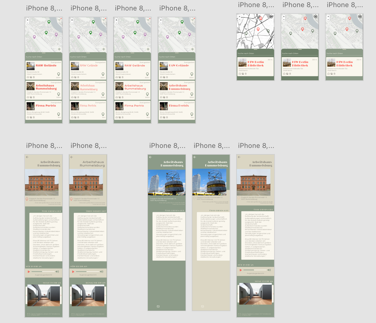
What led us to choosing this project and spoke to us the most was the challenge of finding multidisciplinary ways of storytelling and educating people about historic events. After doing some research on multimedia supported storytelling and existing solutions for audio walks we decided to shift our focus from defined routes to connecting specific places in the city to impactful events that had taken place there sometime in the past. This changed the use case of the app from actively following a route to letting your app run in the background and send you location-based notifications, when you approached a location that you could explore further. Expanding the application possibilities from a dedicated time to everyday life.

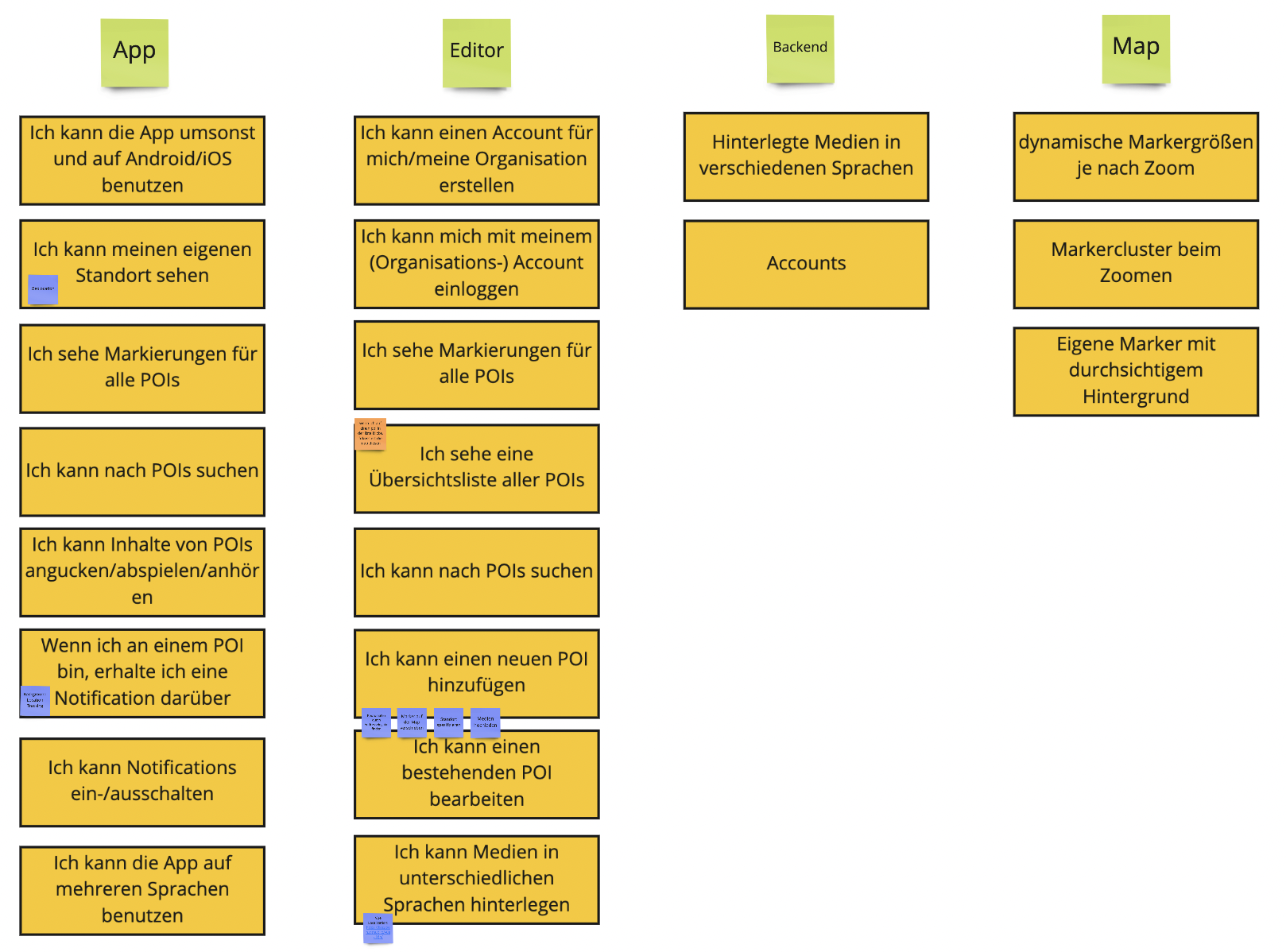
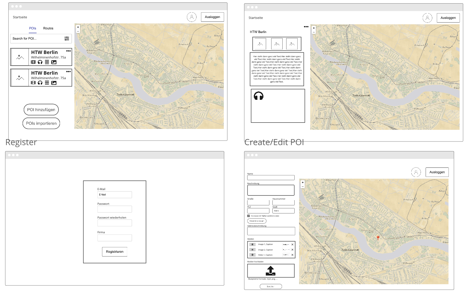
When brainstorming and envisioning how we would like to use the app ourselves, we decided to include different topics. This gives users the chance to chose which of them are relevant to them individually and personalize their experience on the one hand and requires a content management system, that lets different parties provide data and expand the possibilities dynamically on the other hand.

Prototyping

To decide on what features we would like the applications to have, we used Miro to document our ideas and decisions.

documented features in miro
Features

Then we built wireframes for the app and the editor’s user interfaces. By doing this, we were able to decide on a general layout and structure for the interfaces without getting too involved with the details.

wireframes of the editor
Wireframes of the editor
wireframes of the app
Wireframes of the app

While starting the development process and implementing the main features, we also worked on a visual design for the app in AdobeXD. This is where we decided on our color scheme which was later incorporate into the editor as well.

prototype design in adobexd
App Design

Development

Workflow

We worked in two-week sprints in the form of milestones, for which we defined issues at the beginning of the sprint that we would like to work on in the upcoming sprint. During the sprint, we continuously merged our newly created features into the dev branch through merge requests that had to be approved by another team member who were assigned as reviewers. After each completed milestone, we merged the dev branch into the main branch to trigger the deployment of our application.

Challenges

One of the main features that distinguishes the mobile app from others are the notifications that are based on the geolocation of the users. The challenge with this feature is that the location of the user has to be periodically updated while the app is running in the background. This was accomplished by using the capacitor community plugin background-geolocation which provides the functionality to add watchers that keep the app running in the background and receive geolocation updates. On Android, devices a notification has to be shown the entire time the app is running in the background. A local notification will be sent when the user is nearby a POI. Local notifications are triggered by the app itself, rather than a push notification from the server. The local-notifications plugin was used to implement this feature. To avoid unnecessary battery drain, it was difficult to figure out the timing interval for location updates and to adjust the radius that counts a POI as nearby appropriately in order to not miss it while walking by.

Another challenge was to provide multi-language information. This applies not only to static UI elements of the editor or app, which can be easily translated by the library i18n, but also to the POI, categories and assets, which must be able to be created and displayed in different languages. For that we thought about solving it through a query parameter, which creates the corresponding depending on which language the detail POI view is displayed in. But still, the default language of our WH2 Editor is German, so every POI, category or asset has to be created in German before a translations can be added.

When setting up our CI/CD pipeline, we encountered another, very unexpected challenge. We created a pipeline using GitLab’s built-in CI/CD tools, but when trying it out, we discovered that there were no runners available for our project’s pipeline to be executed. Because of that, we decided to host our own runner on our project server. This posed us with a new problem: Since deploying on the Docker host from within a container seemed to be a quite complicated task and the runner used up most of our server’s resources, we decided to move the deployment to an EC2 instance on AWS.

User Test

To test the mobile app, we decided to conduct a heuristic evaluation with four testers (two with usability experience, two regular users) to find usability issues. The testers were given a short introduction of the goal of the app and were then instructed to explore the app by themselves. Problems and questions that were encountered during the exploration were noted by us. Afterwards, the testers documented their findings of usability problems according to the usability heuristics by Jakob Nielsen.

The most common problem that was found during the evaluation was that users did not notice or understand the use of different colored markers on the map. In order to help users understand this feature better, we implemented the introductory slides and an additional help button that explains the use of categories and colors. Another usability issue was found with the navigation to the settings of the app. In the past, the settings button was positioned at the top of the filter page, leading testers to believe that the settings were connected to the filtering. Our solution to this issue was to add a central menu button at the top of the home screen to navigate to the filters, settings and help.